Thinking about my recent amateurish wall painting made me remember what a wonderful connection there exists between painting and Karate.
Or just between the fine arts and the martial arts.
As I recently read:
“[…] people who have mastered the secrets of martial arts are said to have mastered the common points of paintings and calligraphic works. It is not rare that famous martial artists of Japan and China are well-known painters and calligraphers.”
– M. Nakamoto, “Bujutsu to Geijutsu” p. 40
The examples of warriors mastering the finer arts are many.
Now, as we know, there are several philosophical and theoretical (yet tactical and practical) concepts in Karate, like Shin-Gi-Tai, Bun-Bu-Ryo-Do, On-Ko-Chi-Shin and many more. And the interesting part here is that similar concepts have naturally evolved Shodô calligraphy (lit. “The Way of Writing”) too, but under different names and labels.
The underlying principles remain.
So, today I thought I would teach you one such concept and see if you can connect it to Karate. It is actually very easy to draw the parallel on this one, but nevertheless it’s an interesting one.
Let’s see if I remember what my calligraphy class taught me in Okinawa:
The three styles of Shodô
(In calligraphy there are actually very many styles of writing, but we’ll be focusing on the three main ones in this article.)
1. Kaisho – the first style
The first style a beginner learns when starting to practise the art of calligraphy is kaisho (the “formal”, or “square” type).
It is of utmost importance that a student always begins by learning kaisho, since this script is the most basic style and is required to get a proper ‘feeling’ before advancing to the other styles. The character kai (in kaisho) means “correctness,” which is quite logical, since each of the strokes in each character written in kaisho is drawn and placed “correctly”.
Here’s an example:

When writing kaisho, the the brush is lifted from the page for each stroke. All the strokes are written distinctly, and the characters appear basically as if they would have been printed by a word processor. As you can see in the example above, the characters of the kaisho style are perfectly square and angular, with regular spacing.
But beware – Kaisho doesn’t teach just the basics.
Kaisho teaches the students how to apply the basics (which go by names such as ‘the vertical stroke’, ‘the horizontal stroke’, ‘dot’, ‘spatula’, ‘claw’ etc.).
Kaisho gives the students a feel for correct placement and balance (between white and black, left and right, up and down etc.).
Characters written in kaisho are easy to copy, and instantly recognizable.
2. Gyosho – the second style
Gyosho is the more cursive script, roughly approximating normal, everyday handwriting. It is often referred to as the semi-cursive script.
Here’s what it looks like:

As you can see, it’s the exact same characters that we saw in kaisho, but this time it’s in gyosho.
In gyosho the strokes are allowed to run into one another, and characters appear less angular and more round and fluid (as you can see).
This is because when writing in gyosho style the brush leaves the paper less often than in kaisho. The mind is already thinking about the next technique, sorry I mean stroke (you’re supposed to do the connection yourself, remember?) and this gives gyosho its distinctive look.
The average person in China or Japan can read characters written in gyosho style with relative ease, but foreigners or people who are learning Japanese may have difficulties understanding exactly what they’re seeing.
That’s right.
Think about that one.
3. Sosho – the third style
The last category, or style, that Shodô is commonly split into is called sosho. It would be something of a humongous understatement to call it a style easy to read.
Here’s what the exact same charactes (which we earlier saw) looks like when written in sosho:

(No, it’s not a self portrait by Picasso.)
Sosho is the most cursive script of them all, and it is frequently impossible to read characters written in sosho style without having nearly mastered the style yourself.
This is also because a character written by one master might look completely different when written by another master.
In kaisho they would look identical.
Actually, the apparent anarchism that ‘governs’ sosho states that entire characters may be written without lifting the brush from the paper at all, and characters frequently flow into one another, forming a sort of hypnotic blur.
Strokes are often modified (or eliminated completely!) to facilitate smooth writing and to manifest the feeling and meaning of the kata (whoops!), technique (whoops again!) character.
This often creates a simple and abstract appearance.
The paradox, of course, is that most laymen think that sosho is the style beginners write (judging by its wabi-sabi look), and kaisho is the one masters write (judging by its heavy, angular and correct look).
Now…
Try to make the connection to Karate (and especially to one certain philosophical concept) and things become much more interesting.
I promise.
Oh, and one last thing:
In calligraphy there is a famous proverb that has been around since old times (originally from China), which goes something like:
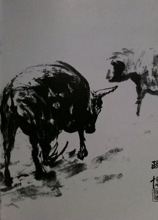
“There are five colors in black ink”
Five colors meaning unlimited colors (it’s a Chinese thing, don’t ask why).
In other words, when you can express every color (read: emotion) simply by using one color (black ink) alone, you are said to be a true master of painting.
How about Karate?
Let’s try with:
“There are five techniques in the straight punch.”
(Five meaning unlimited.)
Let this be our aim.
Because, in the end, finding the equality between the fine arts and the martial arts inevitably means finding ourself.
Like everything else.


7 Comments